Saturday, October 31, 2009

Stephen Quiller Workshop – fabulous Friday

October 23, 2009 opened with Steve teaching about greys & near greys. We select neutrals that best fit with the colors and desired mood that we have chosen for our painting. Naturally, the choice of support will also influence the visual quality of these color choices. Rough watercolor paper is ideal where granulation is desired.

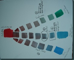
  1. Grey /neutrals -- these are mixes of color in which no color bias is visible. Example red-orange and blue-green [if the correct hue is used] will mix to a perfect neutral gray. 
  2. Near greys -- like a neutral grey, these can be mixed with just two colors. However rather than having no color identifiable, one or the other color is allowed dominance. Example, red-orange and blue-green mixed just to the blue-green side.
  3. Near greys using a complement’s neighbor. Example, rather than using blue-green to neutralize red-orange, beautiful nearer greys can be made by using either blue or green.

Examples 1-3 are labeled on the chart below:
redorange near greysSteve also demonstrated how naples yellow, cobalt violet ,and cerulean blue can be used together to make a high key triad. All of these colors are beautiful granulating pigments and a mix of all three gives a gorgeous near grey [see centre of next photo]. I'm a big fan of granulation so this was a real fun eye-opener for me. A more complete description [a full two-page spread] of this triad is given on page 38 of Water Media Painting with Stephen Quiller.

 naples quiller violet cereleunSince returning home I've had a chance to read Steve's description of the various categories of watercolor paints [in WaterMedia Painting], including a description of organic versus nonorganic watercolors, the visual qualities of watercolor paint [granulating versus staining], and how to best employ all of these various types of watercolor paint. Suffice to say I think this book is a valuable resource. I expect to be referring to it for years to come.

watermedia_painting

In the afternoon Steve moved on to a discussion of various binders used in water-media painting. All of the binders [watercolor, gouache, casein, & acrylic] in use today have their own natural strengths. To demonstrate the various strengths, Steve painted a landscape using a combination of acrylic, watercolor, and casein paint. Believe it or not he began with a loose wash of acrylic! Like most of the students, I had assumed that once you used acrylic you would no longer be able to over paint that area with watercolor. However, as long as the acrylic paint is applied thinly, other water media can follow because the surface has not been sealed. Once the acrylic was dry, Steve painted over portions of it with watercolor first, and then with casein, allowing the background color [yellows and oranges] to glow through in places and leaving it completely uncovered in other areas. Again, it was quite a show!

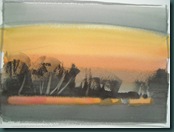
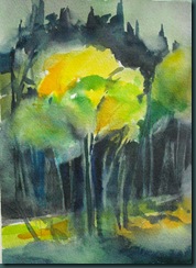
Naturally the next step was for us to go away and execute our own little painting using these principles -- here is mine.

DSCN4069 Enjoy!

Retweet this

Thursday, October 29, 2009

Stephen Quiller Workshop – day 2, part II

The last portion of Thursday Steve did a major watercolor demonstration.  Before beginning the painting Stephen provided some background information that was very valuable. In short here are the points:

  • Steve uses Richeson watercolor paper, usually 300 pound rough. The Quiller Gallery website has some interesting information with respect to this paper. You can find more information in Stephen Quiller's books also sold on his website.
  • The watercolor paper was prepared with a sketch made in pencil with very little detail. Stephen does not work from photographs but sketches in a fairly large sketchbook. In the margins he makes notes with respect to the color, time of day, ideas he has for a finished painting, etc. so that he does not lose that information. This is enough for him to paint from but not so much information that he's "painting to a photo". He recommends making thumbnail sketches to pre-determine shapes as well as a quick value study in order to ensure that we are painting a composition that will be pleasing. Good composition trumps good technique.  Sounds VERY familiar.
  • When Stephen works at home he works vertically. When he's wetting the paper before painting he would begin working from the bottom up. This is to avoid having water running down the page multiple times creating troughs in the sizing [gelatin] which would result in streaky applications of paint.
  • He has only one painting going at a time! I found this very surprising -- he works from beginning to end on a single painting almost always.
  • There a few colors in the expanded palette that should always be squeezed fresh when working in watercolor: cerulean blue, manganese violet, viridian green, and naples yellow. These colors do not reconstitute well. 

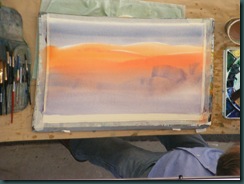
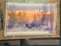
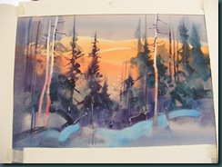
Then he began to paint!!!  Over the course of the next two hours we were treated to a wonderful show. What fun to watch a master at work -- the rhythm is amazing! He paints in a very mindful, deliberate, responsive way, constantly "listening to the painting" and doing what it tells him to do. After 40 years of wet brushes paintings do talk to you!  Here are a couple of photos of the work as it developed Thursday afternoon.

DSCF5098

Background washes – very careful to leave the light on top of the distant hills.  The brush says the form.

DSCF5100

The first, loose foreground shapes…

DSCF5103

Lifting out some tree trunks – watch the intervals!, watch the shine on the paper!, brush drier than the paper to avoid blossoms!….  Mindful of all these things AND telling us about it as he painted. 

DSCF5105

Pure Thalo blue there???  Yep, sure enough it worked.  Developing more tree forms.

DSCF5108

Pop some of the trunk area by adding the winter branches and a few snags [do it FAST].  Surround the work with white strips, step back and think it over.  Push on when you know the next step – not before!

Stephen quoted Robert Genn as he concluded and sent us to our painting - “Better to stop 5% too soon than go 1% too far”

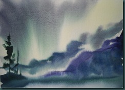
Here’s the study I did late Thursday afternoon.  I like it – the feeling of cold and wet is there. 

stormy dayWow – what a great afternoon!  So much fun I would love to do it again.  Enjoy!

Retweet this

Wednesday, October 28, 2009

Stephen Quiller Workshop day 2

To begin day 2, Steve briefly highlighted day 1 color theory before launching into a discussion of color family [see his books “Color Choices” and “Painter’s Guide to Color” for details].  A limited palette, such as he employed in both of the examples below, helps emphasize a mood.  In both studies, “neighbor” colors were used to create mood, in some cases they were neutralized or grayed down by using their compliment.

DSCN3927 DSCN3928

It’s amazing to see Steve sketch up these quick studies carefully constructed to showcase the particular point he is driving home.  He keeps up a steady monologue about the colors he’s chosen, why he’s putting what where, composition choices, etc.  He uses humor at the least expected moments to keep everything fun.  Note – there is no “black” pigment on the Quiller palette.  Like many other artists, Steve uses complements to mix lively blacks and neutrals.  The wonderful darks that can be created using phthalo blue and it’s compliment are evident in the dock study. 

Next step – a double analogous study [see Painter’s Guide to Color].  In short, double analogous simply means 3 neighbor colors PLUS their compliments are used and are visible in the painting.  In the examples above the compliment color was used only to move the colors towards neutral but always played an invisible role.  Just for laughs and chuckles I’m including Steve’s effort [done with an annoying audience] below that mine “paint along”… 

 double anal DSCN4077To capture the point of this exercise [which I think I missed at the time] Steve allowed each of the 6 colors to “live” in the study.  If you zoom in to his you can see yellow-orange, yellow, yellow-green, red-violet, violet, violet blue ALL visible.  However, he was careful to consider dominance in color temperature…  his has a dominance of cool, dull tones and a few notes of pure yellow that sing by comparison.  Beautiful…  by comparison my little study has roughly equal area of cool colors and the yellow is popping out all over.  So, plenty to chew on for me…  and enough for today.  Day 2, part b tomorrow!

Retweet this

Tuesday, October 27, 2009

Stephen Quiller Workshop – Spokane Oct 21-25

I’ve just returned from a week long workshop instructed by Stephen Quiller.  I feel blessed to have had an opportunity to watch Steve paint let alone have him pass on some of the knowledge he has accumulated over 40 years painting water media on paper.  He is a gifted teacher and I enjoyed every minute of the workshop.  I want to document some of the highlights here in my blog beginning with day 1.

We began with color theory – complimentary colors mix to a neutral grey.  It really does matter which particular pigment or brand of paint you use as resulting colors vary greatly.   Steve drove this point home with several demonstrations mixing neutrals to a perfect compliment. 

Palette – has anyone ever seen a rectangular color wheel?  No, I didn’t think so.  The Quiller palette is the shape of – you guessed it – a wheel.  We spent quite a long time Wednesday morning setting up our palettes and after a trip into the store for supplies we were set to paint.  I really enjoyed mixing the colors in this logical palette – SO much easier.

Next, we worked our way through the basics of value and intensity and completed several small studies.  I hope to complete some value/intensity grids to fix this more firmly in my head.  Stephen describes many aspects of his painting in musical terms – completing these charts would be comparable to learning scales on an instrument. 

There are an infinite number of possibilities for value and intensity of color mixing on this 12 color palette.  In the two studies below we explored value and intensity using just 2 colors [perm. green light & manganese violet].  The left study has a full range of value AND intensity.  On the right I used a full range of values [from very light to very dark] but the intensity of the colors is more neutral and therefore more moody.

full value and intensity full value but less intensity  

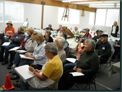
In the photo below Stephen elaborates on choices for using color effectively. 

using color against colorIn the photo below some of the Calgary gang is front row and centre and definitely enjoying themselves.  It was a very enjoyable day.

listening raptly

Retweet this

Thursday, October 1, 2009

Altered book spread – HospitaliTEA

I’m posting this in the airport – Chicago’s O’Hare.  It’s very loud here!  I’m sitting just inside the security gate and it’s funny to watch the contortions people go through to get back into their shoes.  They are also insisting that everybody with a belt on remove it for the inspection – I can’t describe some of the funny scenes, haha.  I’m glad it’s not me.

Heidi spread 1 Now, on to art.  I’ve shifted gears to Heidi’s book and her theme is HospitaliTEA.  I’m still in sewing/embroidery mode and I was inspired yesterday [when I should have been packing] and sat down at the machine to whirr it up.  On the right we have a lady’s skirt with apron…  trimmed with TEA words.  Tea m, Tea l, Tea k Tea…  On the left I traced a teapot and cup on [window light box] and messed around until I got a zigzag stitch that mostly covered my lines.  I added the reference to Hebrews 13:2 “Do not forget to entertain strangers, for by so doing some people have entertained angels without knowing it.” 

My flight leaves in an hour and I’m looking forward to a short flight and a long nap.  I was up way too late last night as always happens when I’m excited to get going and mindful of all the things I might forget!  Enjoy!

Retweet this