Tuesday, November 24, 2009

Altered book – Heidi’s last spread

It’s been a long time since I posted on my blog…  too long.  But, I’ve made a lot of progress with preparation for the Dec 5/6 Market Collective.  More on that soon.

This evening Sharon, Lindsey, Sheila, Heidi and I met for a little windup party for our altered book collaboration.  It was so much fun to pass the books around and talk over the various methods used.  What a talented bunch of friends I have! 

Heidi spread 3Here’s the last installment for Heidi’s book.  The hospitalitea theme was such fun to work on!  This is a simple spread which began with black gesso over all but the animal parade at the top and the small teapot still life in the bottom right.  To that I collaged a photo of one of my paintings before rolling some whitish/yellowish paint over a letter stencil to add some texture.  Some old scrapbooking stickers  and some collage bits from tissue paper [the kids are cute!] followed. 

Happy Thanksgiving to all my friends and family in the USA!

Retweet this

Monday, November 16, 2009

Manitou Day Lilies Revisited [8”x8” watercolor]

Over the past few years I’ve accumulated a lot of paintings in various stages of completion.  I did this painting and blogged about it about a year ago.   This is what it looked like then.

lillies

Something has always bugged me about it but I couldn’t put my finger on it.  I decided I’d give it one more chance by glazing the busy background and distracting colors in the leaves with a unifying, complementary violet.  A friend was over here painting that day and she suggested that the left lily just wasn’t working shape-wise…  [never-mind that’s how God made it, lol].  So, I went to work reshaping the top petal and pushing it back into the background.  I also lifted some paint out of the lilies and gave them some highlights.  One last step seemed advisable…  I cropped the painting down to make the right lily dominant.  I like it a LOT better.  What do you think?

manitou day lilies

Retweet this

Sunday, November 15, 2009

Egyptian Beach Fun [14x11, watercolor]

EgyptI sketched this watercolor up based on a photo Candice and Doug brought back from their trip in 2005.  I really like the sense of depth that I’ve achieved in this one.  I’ve just checked freight to Japan so I am POSITIVE that Candice will not be getting this for a few more months, and NOT in time for Christmas [surprise!!].  $97 to ship one little painting is too rich for my blood.  Enjoy!

Retweet this

Wednesday, November 11, 2009

Misty Mountain Morning [17 1/2” x 13 1/5” acrylic on Canson watercolor board]

misty mountain morning

I puttered on this painting a bit yesterday and again today and I think I have the feeling I was looking for at the beginning.  There really is no end to what can be done with acrylics! Taking things out and putting things in is far easier than it is with watercolor.  But, I’ve taken this as far as I can right now.  I’ll live with it a bit before I decide whether I need to do anything further. 

I am now into the “guilt free zone” with acrylics…  no more watercolor purist for me!  I’ll use whatever works to get the job done.  Sometimes that will be watercolor, sometimes acrylic, sometimes mixed media…  On Monday I had my second mixed media class of the fall.  We’re spending a few weeks on acrylic techniques before moving on.  Fun times!

I spent most of today updating my inventory log and measuring paintings in preparation for mats and/or frames. I have 40+ paintings that I’m finally getting ready to sell.  I will post them all here soon and you can have first dibs on them.  Cheers!

Retweet this

Monday, November 9, 2009

Acrylic Landscape… start

acrylic mountains and trees

Acrylics…  wow, it’s going to take a little while to work the kinks out of this new medium for me.  I find the transparent, translucent, and opaque qualities of acrylic a challenge to apply.  In this painting I struggled to get the misty feel with the translucent veil application – the tube acrylic didn’t blend easily with the water and I ended up with streaks down the left side.  Two things will sort this out: more experience and using fluid acrylics instead of the tubes. 

Somehow when I see my work in the small thumbnail format like this I can see the obvious compositional flaws.  In this painting I have a tangent in the bottom left corner where the snow bank lines up with the bottom right branch of the tree.  While I’m sorting that out I will also rework the branches to give them a bit more variety.  Right now they look strangely even in places.  If I fix that area and push the values a bit further in a few places I should be happier with the result.  I will give this one another go soon and post the results…  until then, ciao!

Retweet this

Friday, November 6, 2009

Altered Book spread – Tea

Many of you know that I’ve been involved in a collaborative altered book project since May.  I got off to a late start due to the birth of my grandson Kai in May so I’m just winding up now.  I have this spread and one more to tell you about. 

tea 2nd spread

The hospitali-tea theme for Heidi’s book has been fun.  It has brought to mind all the fun tea-parties I’ve attended over many years - first as a child, then a mother, and now a grandma.  We could all stand to have more of the simple joy of a child’s tea-party.  On the left page I transferred a photo of 2 little girls entertaining each other and their doll.  Weeks ago I found some colorful photos of china in Sheila’s [thanks] stash and I collaged these on the right side along with a quote from George Gissing, “the mere chink of cups and saucers tunes the mind to happy repose”. 

Have a cup of tea with a friend soon!

Retweet this

Wednesday, November 4, 2009

Stephen Quiller Workshop – Sunday October 25

I have just one more demo to review from Sunday at the workshop. This one involved snow again – I think we caught Steve in his windup to the ski season!

In this demo Steve was using Crescent watercolor board which had been toned with a thin layer of neutral violet and blue acrylic, cooler at the top and warmer towards the bottom of the board. As Steve sketched up his demo he briefly reviewed the way that, given a single light source, cast shadows radiate out from an object. He also described these shadows as darker and cooler closer to the object casting the shadow, and lighter, warmer and more diffuse further away.  Obviously this was not news but described in a way I finally “got”. 

After this introduction, Steve laid in some tree shapes in the top right of the paper to give us a feel for where the light and shadow Janis photo sun am5should fall. Then he took a titanium white tinted with yellow and painted negatively around the shadow shapes. He added a warmer yellow mix along the edges of the light and made sure to add some of Janis photo sun am3 the dappled light that would filter through higher branches. Some of the warm yellow-orange was painted negatively around in the tree shapes as well as on the sky area beside it. Finally, white dots were joanne pic of snow shadow painting added inside the light areas to create halation effect. The result is a very convincing scene of woods backlit by a sunrise or sunset. [first 3 photos were in overhead mirror, thanks Janis and Joanne for the pics].Janis photo sun am Beautiful.

It was such a privilege to learn from such a gentle, humble master painter. I hope I have the joy of sitting under his teaching another time – who knows... maybe even next year in Scotland!

calgary gang with stephenThe Calgary contingent with Steve on Sunday 

I would also like to take this opportunity to thank the folks at Spokane Art Supply for their awesome hospitality, especially Shirley for keeping things organized and running smoothly and Claudia for her amazing baked goodies!

And now to paint... ciao!

Retweet this

Monday, November 2, 2009

Stephen Quiller Workshop – Spokane, Oct 21-25

Yesterday’s blog described Steve’s teaching on the use of acrylic transparently. The terms transparent, translucent and opaque are discussed in depth on page 43 of WaterMedia Painting with Stephen Quiller. Suffice to say that an artist can achieve some very interesting visual affects playing these techniques off of each other.

Please note – many of the photos appear backwards as they were taken in the overhead teaching mirror.  The finished pieces are oriented correctly.  Thank you to Janis Kestle and Joanne Edie for providing most of these photos. 

Saturday afternoon. Steve demonstrated the use of transparent and translucent color in a dockside demo. He used a transparent background wash of yellows which had been allowed to dry completely. Adding a small amount of white paint to a thin wash of janis acrylic sunday5 janis acrylic sunday3    muted blues and violets he painted negatively around a boathouse, a dock and a boat... but the subject did not matter as much as the point. The transparent passages just glowed against those translucent areas. By this point I was mesmerized and apparently incapable of making decent notes. Therefore I am going to let these photos tell the story.  Magic…

janis acrylic sunday2janis acrylic sunday

After allowing us some time to work on our own we regrouped and Steve began a demo using transparent, translucent, and opaque acrylic on Crescent watercolor board. This is a very thick support relative to even the 300lb watercolor paper Steve had been using to that point in the workshop.

Steve had prepared the board with a neutral blue through violet tone and had allowed it to dry. After a very quick sketch Steve painted in DSCN4001 a shockingly red-orange tree – his centre of interest before developing the snow bank and trees with broad loose strokes. He laid a purplish, translucent veil over the left top trees which just melted in to the previous paint and muted it. He moved on to paint the light DSCN4002 falling on the hill behind the red tree a thick, juicy yellowy white. A similar mix was used to define the light peeking through the trees in places. Various details – snags, scrapes, branches were put in here  sat red tree demo 5 and there with a rhythm that was a lot of fun to watch. It was like seeing a musical performance on paper. At one point Steve commented that “mark and energy is the key to the emotion of the piece and is what the viewer will connect with”.

DSCN4003

Steve wet the entire bottom section and painted the reflections by pulling straight down from top to bottom. He worked his magic on the details even here lifting out some areas and lightening others with the yellow/white mix. He described this as partly defining the  joanne sat pic of reflections reflections that would be visible and partly just responding to what the painting needed. The entire process continued into Sunday morning but I think I will just let the photos complete the story.

DSCN4010  DSCN4008 It was an entertaining and stretching experience indeed! 

Retweet this

Sunday, November 1, 2009

Stephen Quiller Workshop – Saturday – Acrylics

Steve began the day with an introduction to the acrylic medium. Acrylic is by far the most luminous medium available, even surpassing oils. It is also thought to be the most durable, although it will take a few hundred more years to prove that. It is a non-yellowing, strong, transparent and versatile binder. Steve believes Richeson’s acrylic to be the best binder of all acrylics based on the “stretch test” which proves it holds the most pigment. You can read more on this subject on the Quiller Gallery website.

Statistics show that 1/3 of painters use acrylics to some extent in their work so it has become a very popular medium. Next Steve reviewed his 12 color spectral palette [MUCH more on page 54 of 
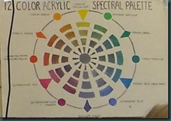
Watermedia Painting with Stephen Quiller] and began a demo of how to use acrylic transparently similar to using watercolor.

acrylic set up and sketchHere Steve shows us his preliminary sketch and has his tubes set up to squeeze.  

about all I need to do for now40 minutes later Stephen arrived at a stopping point…  FORTY minutes!!!!  In this photo you can see the overhead mirror which made it easier for students to see what was going on. 

I must admit that, having painted very little in acrylic, I was scrambling mentally to keep pace with the volume of information at this point. I did relearn these points:

  • When acrylic is used transparently [like watercolor], it will dry the same value as laid. If it is applied thickly it will dry darker.
  • Paint does not granulate the same way it does in watercolor applications.
  • Lifting paint and softening edges must be done before the paint dries – once it dries, it won’t lift.

After we had a chance to use these techniques for a bit, we regrouped and Steve changed the entire feeling of his demo simply by glazing [applying paint very thinly] over the top portion of the painting with a red/orange color. Look at the difference that made...

sat am beginning   Before the glaze                             After the glaze.

And, once again hidden at the bottom of my blog, here is my effort on this technique.  [ouch]

DSCN3942I’ve got a lot to learn about painting with acrylics.  Fortunately, I’m going to get a chance to review this again soon.  Sharon Williams is instructing a class through Chinook Learning Services called “Paint Creatively with Watermedia” and we begin tomorrow.

As I plow through the notes and photos I took over the course of the week I am reinforcing the things I learned.  It’s amazing how much ground we covered in the five days.  Part II of Saturday tomorrow…  ciao!

Retweet this