This blog documents my creative journey with watercolor, mixed media, & oil painting. I'm enjoying myself immensely and hope you find something uplifting in my paintings and/or their stories. This blog is primarily about PROCESS. If you'd like to check out PRODUCT, please contact me for information.
Friday, March 25, 2011
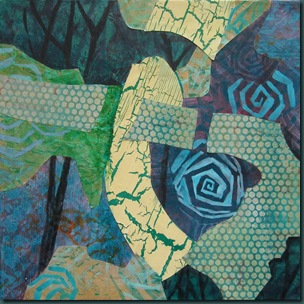
Falls [acrylic, 11"x14"]
Monday, March 21, 2011
Untitled abstract [still WIP on 40”x60” acrylic]
I’ve continued to work into this painting in several ways. I’ve continued some of the patterning but varying the application – thick physical texture [the lightest band], implied texture [paint sponged through a mask], sometimes transparently, sometimes translucently or opaquely. I also applied a glaze to the background area – varying warmer in some areas, cooler in other places. This seems to be progressing slowly and I expect to have many more layers of glazes, ending on the cool side.
As you can see, I played around with a variety of sizes of verticals behind these main lines. I’m not sure whether this is working or not but I know what I’m going to do next. The existing elements have somewhat interesting angles and some variety but I need to push those size and angle differences further. I will link some of the shapes by bringing them closer in value and other shapes will be entirely new. I believe this is where the painting takes over from the viewfinder design - later than I expected actually.
Big project, big time fun! However, I’ve got to find a more ergonomically correct painting posture for these larger paintings. My back gave me some serious trouble for a few days last week… but on the upside, it settled down quickly too. Sore is my “normal” but flat on my back on ice? not so much! The new longer brushes and roller help a ton though! Where there’s a will, there’s a way!
I’m off to Fairmont tomorrow for a week. Looking forward to the hot springs and lots of painting time – woot!
Retweet thisSaturday, March 19, 2011
Not Committing Yet [this is not a title!!]
Here we go again… more painting on my 40”x60” canvas. This time I worked with my letter stencil and darkened the value in places. Then I used a different stencil and mixes of the three colors and white in the background…. enough for one day on this project. Here’s the photo of my progress: 
Friday, March 18, 2011
Creating a Monster 101 [this is not a title!!!]
I jumped in with both feet when canvasses were on sale a few weeks ago… the largest size is 40”x60”. If you’ve followed my blog EVER I know you’re thinking – ARE YOU CRAZY?!?! Let’s just say I like a challenge. Besides, as my mother said, I’ll never learn any younger!
So, how is this little project going? I’m having fun… kind of expensive fun but still fun! I laid it down on my studio floor, sprayed it with a water bottle and glazed on a few very light layers of my latest favourite trio – quin gold and crimson, and thalo turquoise. I used my new long handled paint roller for this – handy!. Then I did another layer, again very light. On this layer I lifted a bit with a very large pattern cotton dresser scarf. Then I lightly blocked in a viewfinder design in a muted green. For the lighter area, I taped off the ribbon shape I needed and used a 12”x12” stencil as a mask… taped down firmly, I applied molding paste approximately 1/8” deep. Here’s the progress to this point… VERY early stages.
Thursday, March 17, 2011
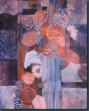
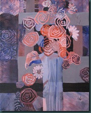
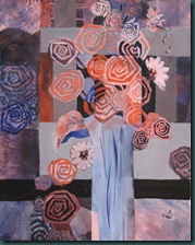
Talisman Roses [16”x20”, acrylic]

Here are a few of the early photos…
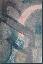
On the right photo I’ve just played around with the two main colors and the beginnings of some stamping. The second photo [on the right above] I’m arbitrarily imposing some light areas based on a viewfinder design. The painting sat like that for some time because I lost all emotional connection to it. Then I carved myself an abstracted rose/spiral stamp and grabbed this start to play around with it. Originally, I simply stamped over some of these circular shapes with my rose stamp and started to play with a grid pattern in places. Eventually, one of those geometric shapes morphed into the vase and I continued to adapt the grid… primarily I toned down some of the orange with neutral lights and darks… it was just everywhere!!!
Below left I’m working back and forth on the grid and then on the floral shapes… on the right I’m adding darks in the focal area and further developing the grid.
Monday, March 14, 2011
Meet Me By The Garden Gate [collage, 10”x10”]
I find it really fascinating how just a little change can make a big difference in a piece. I worked on this for a while at class after we did our critique time. I was a bit hung up on making the idea of this garden abstract work so I pushed away at changing how the garden gate is seen, dropped the value behind the bench by adding a lighter paper and moved some of that warmer orangey color around in the composition. I like it much better and yet my bench is still coming off very subtle, maybe too much so. Hmmmm. That might be okay since the rose is such an obvious focal point but I may have just a bit more work on that right side. Here’s how it looked on Friday’s post:

I’ve generalized this into other areas of life as well. I can accept critique much more objectively in many areas of life [not all ;) ] because this muscle has had some exercise in art class. It’s good for me to hear how others would solve my problems. It’s just so like real life for us to offer our own solutions to another person’s problem [real or imagined]. I can hold these pieces of advice more as suggestions, rather than resent them as intrusions into my personal business. It seems to give me a better perspective… like I’m stepping waaaay back from a painting to get “the big picture”. So…. art really does inform life – all of my life. Just one more reason to be grateful that art has become part of my journey here below!
Pray for Japan folks! I’ve got a daughter, son-in-law, and 3.5 grandbabies in Tokyo – all safe, thankfully! But they need our support and prayers now. Thank you!
Retweet thisSunday, March 13, 2011
Water Me Up Some Roses [9”x12”, collage]
When I worked on the collage from last Wednesday’s post, I played up the rose stamp a bit and then I began to see a watering can shape [can’t wait for spring & summer here!!!]. I added several pieces of collage to indicate the gardener’s hand and did a bunch of painting with acrylics. I added the sun with one of my hand carved stamps and then glazed it with quin gold/crimson. Cheers!
Retweet thisThursday, March 10, 2011
Meet Me by the Garden Gate [collage, 10”x10”]
I’ve been having fun with this one today… some flower patterns, the suggestion of an arch, and my imagination was off to the the races. I added the bench on the right and a few dark lines to suggest a park fence. Cheers!
Retweet thisWednesday, March 9, 2011
Collage start 2
This collage is 9”x12” and as I’m looking at it now I see that I’ve messed up as far as the values of the shapes from my viewfinder [shown on the right]. When I’m painting into this collage I’ll work that out. Cheers!
Retweet thisTuesday, March 8, 2011
Collage start…
Monday I started this little collage from a viewfinder design. I used a square mat board cut to 10”x10” as my support. 300lb watercolor paper or illustration board also work well.
Above: left is viewfinder design, right is my collage
The steps used to get the support covered with this initial layer of paper are:
- Trace the main shapes from your viewfinder design onto the support [make sure these are both the same format rise over run, etc]
- Trace those lines onto two sheets of tracing paper – one for your “pattern” and one for your “pattern pieces”
- Using one of the tracings, cut out the collage shapes. Fewer shapes can be easier to work with than lots of shapes… painting into the shapes later, as well as the texture you already have on your collage papers provides some detail anyway.
- Consider the viewfinder design. Which of the shapes feel as though they are behind, or under the other shapes? These are the shapes to cut out and glue down first. Hold the pattern piece against your chosen collage paper and cut around the shape but leave some extra to overlap… Glue these pieces down first and having them a bit too big is a good thing later.
- The rest of the pieces need to be cut closer to the pattern. You may want to allow 1/4” extra on edge pieces so that you can wrap them around to the back – that makes a nice finished look. Cut these pieces out and glue them down. Done!
- The next steps will be to paint into this as well as paint with collage bits. If something doesn’t work out you can use your pattern and collage your way back into your major viewfinder shapes. We’ll see how this goes when I’ve done some of that. Stay tuned!
Sunday, March 6, 2011
Stamp, stamp, stamp
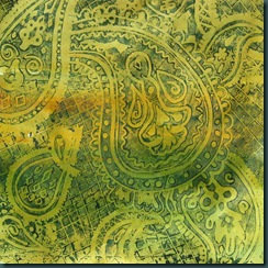
But to do that you need…. well, LOTS of stamps. I’ve been hankering after a paisley stamp and I wanted a big one. I found a 12”x12” carving block last week and I had fun doodling and then carving this up. It takes a while but it’s so worth the work to have your own, 100% unique, tool. I have several hand carved stamps and I estimate that I use them 10x more often than the prefab’d ones I have. Besides, it’s a great feeling to cut into that block… good for the mental health sometimes ;-) Here’s my new stamp and the first collage paper made with it…
Retweet thisFriday, March 4, 2011
Collage prep
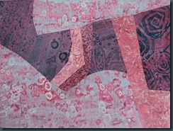
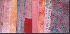
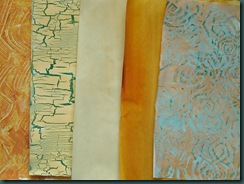
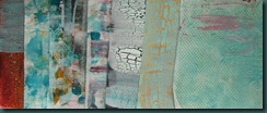
I’m getting ready for the collage unit in my Monday class. This past Monday we worked on a “paper palette” to be used for the next couple of weeks. I chose a triad of Quinacridone Gold, Thalo Turquoise, and Quinacridone Crimson and I’ve worked up these papers from that triad. Most of these papers have at least 2 layers, some have 4 layers… it all adds to the uniqueness of the end product. Hopefully I’ll produce something fun with these next week. Collage work forces the principles and elements of design out into the open better – particularly shape. Making these papers is very addicting… it’s hard to actually stop and paint! 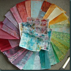

Thursday, March 3, 2011
Lift My Eyes [36”x24”, acrylic]

Enjoy!
Retweet this


