Wednesday, March 24, 2010

Day’s Last Rays [mixed media, 11x15]

days last rays

This began as a monoprint about a week ago and I’ve been puttering on it since with watercolor paint, pencils, conte chalk, and pencil crayons.  I transferred the blackbird in the bottom left from a B&W photocopy using solvent [blending marker].  As usual, I can’t guarantee I’m done with this… 

In fact, here’s the most recent version of “Ferny Places”.  I’ve worked at developing the movement of lights, especially in the bottom half of the piece.  I’m much happier with it now and I love the trees & shadows in the bottom left. 

ferny places5 Enjoy!

Retweet this

Sunday, March 21, 2010

Collage… quidditative with quilters

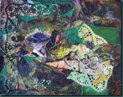
Today I puttered on a 9x12 canvas board that I had previously covered with painted tissue paper.  I collaged a photo of some quilters and some paper lace on first.  I also used the paper lace as a stencil in some places and got some lights back.  Then I painted into the textured surface which was an adventure itself - bits of the tissue are still absorbent, and the paint catches and flows around the hills and valleys of the texture. 

I am working with some themes that fascinate me:  women’s relationship dynamics, social butterflies, loners, motherhood and the weaving all of these together.  Lots left to do on this one…

quilt Enjoy!

Retweet this

Saturday, March 20, 2010

Ferny Places [mixed media, 14x11]

ferny places4I think I’ve finished with Ferny Places…  it gets to be a never ending story with collage and mixed media! I did some more collage into this piece and then came back in with some opaque lights in several areas.  I think the light is moving around pretty well now and I”m liking the colors.  Enjoy!

Retweet this

Friday, March 19, 2010

Spring Climbers & Counting Sheaves – again.

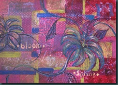
I spent a bit more time on this one today and I think the right side is working a bit better now.  I simplified the background behind the flower by lifting some darker color and then painting a lighter value.  I also darkened the petal centre and tips to better show the light.  The blossom looks much more alive!

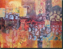
IMG_0054I had a bit more time to putter and I spent it on “Sheaves” which I’ve renamed “Counting Sheaves”…  I bumped up the value difference on some of the elements…  little stuff really, but it makes quite a difference in how I feel about the piece.  The main thing was some negative painting behind the top left sheaf to make it pop a bit more but I also decided to emphasize some small dots and squares across the piece.  They help to bridge lights to darks.  It feels done to me now. 

sheaves

I like the name “Counting Sheaves” because it fits well with my agricultural roots [farmers are always counting something!] and my early career as an accountant…   enjoy!

Retweet this

Thursday, March 18, 2010

Spring Climbers [11”x14”, mixed media]

floral r1

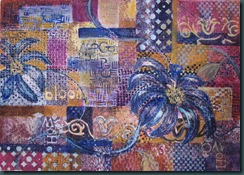
I used pencil crayons, caran d’ache water soluble crayons, watercolor paint, stamps, stencils, and brushes to move this piece along.  I wanted the feeling of a trellis without painting a trellis.  I like it so far but I think I’ll need to strengthen the darks a bit more with a warm color…  right now it’s wandering over to the cool side and I want to keep warm dominant.  Any thoughts out there?

Retweet this

Tuesday, March 16, 2010

Monoprint & Ghost

IMG_0044

The photo above is the monoprint from the plate I posted Sunday night.  The general steps we followed are:

  1. Prepare a “plate" to print from, mine was Yupo paper [basically plastic].   Measure off the plate area that you want to print [depending on your paper size] and mask it with tape.
  2. Paint [I used watercolor] with a brayer, brush, sponge, caran d’ache, watercolor pencils, etc, inside your tape lines.  Dry media can be used as well – pencil crayons, chalks… 
  3. Remove the tape and gently clean anything outside your tape line…  this is to ensure that your print winds up exactly where you want it on the paper.  Place it face up on a flat, dry surface
  4. Prepare your paper - I used BFK Rives printmaking stock.  First soak the paper for at least 3 minutes in a clean sink with a few inches of warm water [longer won’t hurt it]. 
  5. Lift the paper out onto a flat support [drawing board, etc] and remove most of the water with a shower squeegee from one side, flip and remove from the second side…  between you’ll need to dry the board with a clean towel. 
  6. Place the paper between two clean papers [blotting paper is best but drawing paper works too].  Run a rolling pin over the paper to blot surface moisture, but don’t over dry.
  7. Centre your damp printing paper over the print “plate” and lay a large sheet of wax paper on top of that.  Now comes the work…  Rub a printing baren, large flat spoon, brayer or other flat smooth tool in a circular motion over the surface with even pressure.  You can carefully lift a corner to see how it’s printing.  It’s done when you say so or the paper is dry. 
  8. Now you have a monoprint…
  9. You can reprint from number 4 above to get a “ghost”.  Mine is below.   IMG_0041 Next time I’ll paint into these prints with whatever comes to mind…  this is really truly mixed media.  Enjoy!
Retweet this

Sunday, March 14, 2010

Monoprint plate…

I’m back to my mixed media class tomorrow and we’re in the middle of a unit on monoprinting.  Today I worked on two Yupo printing “plates”.  Here’s a photo of the first one…

floral plateIf you look closely you’ll see that I’ve used a couple of words and they appear backwards on the plate.  However, this is just the first step.  Tomorrow I’ll print this plate onto BFK Rives paper.  When it’s printed it will look closer to the photo below, but will be somewhat lighter and softer due to the printing process. 

floral plate reversed

I found an interesting DickBlick video about printmaking papers made by Arches, including BFK Rives.  Internal sizing is critical to getting a good print and papers vary widely in this respect. 

More on monoprinting next post…  ciao!

Retweet this

Tuesday, March 9, 2010

Ferny Places [mm 14”x11”]

DSCN4163I grabbed a little bit of art time today and worked on Ferny Places for a few minutes.  Last week when I posted about this piece I noticed a suggestion of a building shape in the centre bottom.   It’s interesting that what I see in in the full sized piece is different than the thumbnail.  I thought that an old barn or cabin in the woods kind of fit with the ferny places theme so today I defined the building a bit by negative painting around it.  Hmmm, I’ll have to give this one another go.  However, I like the pattern of light and dark in the bottom of this piece…  ciao!

Retweet this

Monday, March 8, 2010

Parker Cole McRae

Our eighth grandbaby arrived early Sunday morning.  Thus no new “art” today.  However, he’s a superior work of art all by himself…  he was 8lb 13oz and 22” long.  What a doll!  Enjoy!

Retweet this

Thursday, March 4, 2010

Ferny Places [mixed media, 14”x11”]

IMG_0022This collage includes National Geographic papers, hand painted collage papers, and public domain images of ferns that I printed with archival pigment inks. I used Golden acrylic soft gel medium to adhere them to the 300lb watercolor paper support.  Looking at it in this small format I like the bit of blue that is weaving it’s way through the background.  I’ll push that a bit more when I get back to this one. 

I’m waiting for a call from my daughter Kim who is due to have her first baby any day.  This one will surprise us – to date we haven’t got a clue whether to shop for pink or blue.  It’s definitely adding to the suspense.  I’ll post some pictures of baby when I have some!  Enjoy!

Retweet this

Tuesday, March 2, 2010

Passages [collage on watercolor paper, 11”x14”]

I had a bunch of extra paint on my palette after painting one day, grabbed a handy 1/4 sheet of watercolor paper, and made light colored start that formed the basis of this collage.  One of the fun collage elements in this piece are the geometric shapes you can see on this close-up.  acrylic bits These were fun to make…  I found the instructions on YouTube but, sorry, can’t locate the link.  Here’s a brief description of the steps:

  1. on a perfectly clean piece of glass [thick retail shelving works great!] I poured, brushed and stamped acrylic paint left over from my painting sessions.  It had plenty of time to completely dry between sessions.
  2. since this is done on glass, both front and back are visible.  When I like what I saw I applied 3 layers of Golden regular gel gloss medium with a brush, drying between each application. 
  3. once that’s dried completely [24+ hours], it is a strong, thin film of yummy color.  I selected bit’s I liked and ran an exacto knife along the sides.  Then, using a flat razor [mine’s in a paint scraper handle], I gently pushed the flat of the blade under and along the glass to lift the piece.  Trust me, it’s easy.

IMG_0014

The photo below shows the current state of this piece.  It feels like a story about passages…  there are multiple paths through this painting for the eye.  I think it makes for an interesting and personal view.  It might be saying something about life too… pick your path!  Enjoy!

IMG_0021


Retweet this