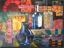
I hadn’t touched this painting since February 25th but took it on again today. I needed to find a clearer centre of interest. So, I
- subdued the large rectangle on the right side
- created additional highlights on the wine bottle
- darkened the top left corner
- made some shadow patterns on the implied tabletop
- cooled the blue of the bottles down to harmonize better with the near turquoise used in some areas.
I like it much better this way. You?
The photo below is what it looked like last time I posted it.
Retweet this

No comments:
Post a Comment