Showing posts with label still life. Show all posts

Monday, July 4, 2011

Paint Small and Often [Carol Marine workshop]

Last Tuesday afternoon was one of the most difficult workshop experiences for me – but I learned a lot.  We selected one item, I picked a kiwi sliced in half.  We painted this item small, 3”x3” squares in my case, over and over.  We had 10 minutes to draw and paint each of these little beasts.  We whined A LOT, and we sweated in that hot, still room. 

Carol was in constant motion making the rounds.  She encouraged me to leave my white paint out of the mix until the very end of this kiwi project – it wasn’t necessary except for the highlights and was causing a dull result.  I was getting it by the 4th and 5th effort [row 1 #4, row 2 #1]…  but I have no idea what happened on the sixth – apparently I unlearned everything!  Carol even did a little demo for the class of my half kiwi before the sixth sketch but the law of diminishing returns was setting in for me health-wise.  When somebody begged to be allowed a new item for the 7th timed sketch, I jumped at the chance to paint this yellow pepper and get out of kiwi-ville.  It turned out okay for a 10 minute sketch but if you squint at the photo of the pepper you will see how dark my subject was on the unlit side.  My sketch should have considered that pretty early on.  Again, value is KEY to painting. 

 10 minute sketches [3x3]

yellow pepper pntg yellow pepper

I learned an awful lot from my Tuesday efforts.  Outlining them in this blog helps to drive home the points again. 

  1. Paint as often as possible. Many small and quick sketches teaches more than one large painting
  2. Use LESS white for many subjects. 
  3. Bring a fan to workshops [wink]
  4. Ten minutes is long enough to consider lights and darks.  Slow down to speed up. 
  5. Painting is SO MUCH FUN [oops! I already knew that didn’t I]

Cheers!

Retweet this

Sunday, July 3, 2011

Tuesday’s Cherries [6”x8”, oil on panel]

tuesdays cherriesI really benefited from the exercises we did on value at the Carol Marine workshop last week.  The two smaller photos below were taken after one such exercise last Tuesday.  In short, we were to arrange a still life and paint it in monochromatic tones quickly [30 minutes for this one I think].  I had some yummy cherries all ready to go [left photo] and the resulting monochromatic painting is the really dull one on the left.  If you SQUINT at them both you should see a similar pattern of lights and darks. 

IMG_0500IMG_0499 

Today I took the dull, monochromatic result of that exercise and layered the colors overtop. I loved doing this – the dark values come through from the first layer and carry the value pattern.  I used the grey study in a similar fashion to the old masters’ technique known as grisaille [grizz-eye].   The resulting painting is the larger photo at the top of this post.  I wish I had a few of these yummy cherries right now – they’d make short work of my munchies.  Cheers!

Retweet this

Saturday, July 2, 2011

Workshop Monday [Carol Marine, Benalto, Alberta]

As I mentioned last Monday, the first day of the Carol Marine workshop we began with introductions.  What a talented bunch of ladies!  I’ve added the bloggers among them to my list of “Blogs I Follow” on the right side of my blog…  http://cherylsdailyblog.blogspot.com/ in case you are interested.

Here’s a photo of 4 apples Carol set up for her painting demo…  and a thumbnail of her complete painting.  This took her about an hour, what with all our demanding questions [lol].  She’s fast and so fun to watch!  It was interesting to see an intentional tangent [the apples are just touching each other] in this composition and how well Carol pulled it off. 

apple setup apple painting

I want to highlight some of the things that I found helpful from each day of the workshop.  First of all, each artist comes to a workshop with particular needs and talents so what resonated with me might have been “old hat” for other participants or vice versa.  I’ll stick to my experience of the workshop rather than the content – after all, that’s Carol’s content.  If you’re thinking of taking this workshop sign up immediately because it is well worth it!

  • Fear… we all have it.  Painting daily helps to relax this performance anxiety.  We reviewed the wonderful benefits of painting small and daily vs big and infrequently…  I’ve experience many that she mentioned – reduced fear of failure, more playful, increased confidence, less emotional involvement.  Try it – really!!!
  • Materials – lots of great points from Carol and tips from the other artists including:
    • Carol’s medium mix – 2 parts linseed oil, 1 part stand oil, 1 part mineral spirits.  I’ll be trying this out after I’ve used up my current supply of Maimeri’s ecoblend
    • lots of the artists were using burnt umber [a color I don’t currently own].  I need some!
    • brushes – Carol doesn’t use very many because she cleans as she goes.  Nice – way less mess at the end!
    • brush cleaning – she rarely does more than clean with mineral spirits at the end of the day.  She uses Murphy Oil every couple of weeks to clean them.  I LOVE this idea – brush cleaning is time consuming.
    • brush storage tool – PVC pipe and cap makes a good seal and then brushes don’t dry out.  That makes cleaning with soap and water less necessary :-)
  • Painting methods:
    • There is no “right” way to paint.  It’s still amazing to me that every artist I observe in a demo has a very unique painting method and style.  I’m getting more comfortable with my own style and finding out more and more how I want to paint – that feels good.
    • Carol doesn’t get hung up on painting inside the lines of her drawing, cutting in and/or overlapping the background in places creates some beautiful effects.
    • I’m getting the feel for the weight of my strokes.  This is critical with oil painting “alla prima” [in one go] because the under layers are still wet.  Digging around in those layers with a new layer is a great recipe for mud. 
    • Squint, squint, squint…  in fact we stopped on Friday morning and took a photo of the class watching Carol’s demo SQUINTING.  We had a great laugh over that – it won’t be easy to forget!

Interesting values [light versus dark] are essential to painting.  Carol gave us 30 minutes to set up and paint a little still life that had a dark, medium and light monochromatic pattern in dominant, secondary, and “smidge” values.  The dominant value in my still life set up  [the cup below] was “mid” [takes over half the painting], my secondary value was “dark” [takes up most of the remaining area], and there was just a smidge of “light”. First I wrote down my pattern, then I painted the cup in a neutral color to match the pattern I had noted in my subject.  You can read all about this on Carol’s Daily Paintworks Challenge from May 21st.  It’s a good exercise in SEEING.
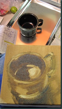
value is essentialAll week, Carol amazed me with her ability to SEE in every way possible – the value, color, intensity, shape, etc. of both her subject and the painting she was making. More tomorrow!

Retweet this

Friday, July 1, 2011

Beginning with the ending…

oranges-bowl-and-knife

I’ve just arrived home from a week long Carol Marine workshop and, although my lodgings were superb [ty Conrad & Teresa], I can truly say I am happy to be home, sweet home!  I’ve neglected my blogging this week due to shortage of time & energy but I’ve painted lots, and I’ve learned even more! 

Tomorrow I’ll begin a day by day recap of the workshop highlights with photos of my work, but today I want to share what happens at the end of Carol’s workshops.  Over the course of the week, Carol painted five 6”x6” paintings during “demos”.  These are made available to student to purchase for a modest price if you’re lucky.  This morning we had a draw to see which students would be selecting a painting to buy, and in which order.  My name was drawn second.  I really wanted Carol’s painting of orange slices, a knife and a little bowl of mine [as yet unnamed].  But, another student’s name was drawn first and she selected this one.  Later, she had a change of heart and we traded – thanks Margreet! 

I love everything about this little painting – the oranges just glow against that blue background and the brush strokes are lively & free.  I find Carol’s style engages me in a way that hyper-realism doesn’t.  As a viewer, I have a role in this painting…  a connection. My eye moves around in the painting noticing the colors and shapes, confirming the story.  The connection is also stronger because I enjoyed watching her paint it!  Throughout the week Carol came by to help me with my painting and every project she commented that the highlights needed to be smaller…  I’ll remember that every time I look at this painting – the dark shape says “knife” with just those small lights on the handle!  Carol with me and my painting!!!

Two very, very tired ladies today… and now to bed!  Cheers!

Retweet this

Monday, June 27, 2011

Carol Marine Workshop

Today I began a 5 day workshop with Carol Marine.  We are meeting at the Benalto community hall near Red Deer.  I'm fortunate to have a lovely place to stay here at my brother and sister-in-laws' place about 40 minutes from the workshop.  This morning we got things going with introductions and some general discussion around the daily painting movement.  Carol's story is such an inspiration and I am thouroughly enjoying this workshop so far.  This afternoon we were given 2 hours to set up and paint a little still life. 


I found these fun little key limes at the grocery yesterday and I set them up on my kiddie blocks with my new little mixing bowl.  I'm hoping to get some help with making the limes read a bit better tomorrow.  They aren't the usual shape of a lime but are round little guys.  Anyway, it was a lot of fun and we're just getting warmed up!
Cheers!


Retweet this

Sunday, June 19, 2011

Tomorrow in Balance [oil, 8”x6”]

tomorrow in balance

More practice in oil painting and I took up a Daily Paintworks Challenge on “balance”.  Setting up this balancing act with a little striped box, a bottle of acrylic paint, and “tomorrow’s” blank canvas was just fun.  It was ironic to paint the bottle of acrylic paint with my oils!  We need hope in the future and signing this painting in the bottom right of the “tomorrow” canvas is symbolic for moving on with life and believing in the future.  Big thoughts for a fun little painting.  Have a great week!

Retweet this

Wednesday, June 8, 2011

Pear Pair [oil, 6”x6”]

Pear Pair A pair of red pears – except there are many, many colors in these “red” pears.  Violet shadows, green, yellow and white highlights, 4 different pigments of red…  all rolled into 2 little pears. 

I’m sure enjoying painting these little guys!  I’m using baltic birch panels sealed with GAC100 and tinted with an orange/red.  The warmth peeks through in places and unifies the whole.  Enjoy!

Retweet this

Tuesday, June 7, 2011

Still Green [oil, 6”x6”]

pear

I’m back to studying the colors and shapes of fruit.  I took on this little pear today.  Even though it sat on a purple fabric, the light reflected back into the pear was orange!  The purple behind the pear took on a reddish cast that offset the green of the pear nicely.  Ciao!

Retweet this

Thursday, June 2, 2011

Wearing Purple [oil, 6”x6”]

Wearing Purple

Weeks ago I decided that I need to do more small paintings on a more regular basis and really study the mundane, simple things around me.  With that in mind I ordered a supply of 6”x6” deep, gallery wrapped canvasses when Curry’s had their sale last month.  I got some help with “seeing” better last weekend. 

Yesterday I set up a still life with just a red onion with a light green background and painted my first 6x6 canvas.  So fun!  I  love the way these colors complement each other.  There’s a real trick to getting the paint to leave your brush when and how you want it to!  I’ve got a lot to work out in that regard.  My hands can be quite shaky at times so I do better when I make a quick, decisive stroke.  Easier said than done – trust me on that!  Location, pressure, direction, angle, all factors in making oil paint work.  Before the stroke you’ve already made several key decisions – which brush? which color? how intense? what value? It’s very, very entertaining…  Ciao!

Retweet this

Tuesday, May 31, 2011

Orange Compliment [oil, 8”x6”]

Orange ComplimentThis is the third painting from the weekend workshop.  I was amazed at how much duller the reflection was relative to the brilliance of the orange!  Given that blue is the compliment to orange [ie mixed together they would be dull greyish] I shouldn’t have been so surprised.  I love painting glass and this was a good challenge for the last painting of the workshop.  One more weekend of focusing on, and painting, what I see – not orange sections and a blue bottle!  So fun! 

Retweet this

Saturday, May 28, 2011

Apple from Liz Wiltzen’s workshop

liz wiltzen workshop This weekend I am lucky to be in a Calgary FCA workshop with accomplished painter Liz Wiltzen.  We’re painting in oils and concentrated on value, color, and intensity today with several exercises.  The goal of the workshop is to concentrate on observing these things carefully, putting down the “true” colors.  Once that has been mastered, an artist can move on to their chosen path wherever they want to be on the realism --- abstraction spectrum. 

For the last 90 minutes we worked up our own small [6”x8”] still life.  I brought an apple that was striated red/green – what a nasty thing that was to paint!  The color was difficult due to the complimentary nature of red/green.  Every time I made a stroke it changed EVERYTHING!  I was reasonably happy with the way it turned out despite running out of time.  The background color was challenging and I’ve made it just a tad too cool in the painting.  More practice tomorrow.  Have a great weekend!

Retweet this

Tuesday, May 24, 2011

Draw [oil, 12”x9”]

Picking up is the only answer for this player…  Note to self:  dominoes are nasty subjects for a “quick” still life painting!!!  But, still better than dabbing at nicks in my walls – FAR better.  Cheers!

Draw

Retweet this

Friday, April 3, 2009

Elitist Still Life

It just occurred to me that all of these objects seem to be turning up their noses at the world - thus the title. I'm not quite done this but it's come along way since last night. I still owe the middle shoe a shadow and I'm debating on whether or not the background needs something. I'm a bit confused about the teapot. The foreshortening is definitely hard to portray accurately and I'm still missing something. I'm loving the colors though... enjoy! Retweet this

Thursday, April 2, 2009

Watercolor again

My friend Sally and I met Monday for some art time. We had a great visit, tea, and set up a still life that I really like. Everything - tea, carving, and the very intriguing khussa shoes are all from India. We took our time drawing the set-up in our sketchbooks and transferring it onto watercolor paper. I have lots of painting left to do (haven't even started the tea pot) but I sure have enjoyed painting in watercolor again. There's just something so pure about it.
Enjoy! Retweet this

Monday, March 2, 2009

Collage tulips...

When it comes to art, Grandma's old adage "a job begun is a job half done" is just WRONG! Sorry, Grandma... I've got a decent start on this 16"x20" piece but I have a long way to go to completion. I did a background in acrylic before I began laying collage elements. Now I've done a bit more painting and I will most likely continue that cycle a few more times... lots of fun. It's puttery though. Tomorrow I'm setting up another piece because I need to have more than one thing going... my brain needs to mull things over between sessions. Figuring out the next steps takes a while. Enjoy! Retweet this

Monday, September 22, 2008

Gumballs With Tea (9"x14")

This piece is a personal favourite mine... one I'll frame for myself one of these days. The colors really work for me and I love the white teapot in the background. It holds great memories from art class...
Speaking of teapots, I'm off to the Coulee for a couple of days... I really need a break from the city (and numbers) so I'm looking forward to the short trip and a relaxing couple of days with my friend Lindsey. I'm sure we'll drink lots of tea. Enjoy!
Retweet this

Wednesday, September 10, 2008

White Tea Pot (7"x10")

I like how the shadows turned out in this still life. The light is shining though the little glass bottle and it makes such a soft shadow on the drapery behind. The shadow of the flower is very delicate too - darker in the middle and on the edges and light shining through the thin flower. Very pretty.
I'd wanted a white teapot for painting and, lo and behold, one turned up for my birthday last April (thanks much). I expect to be painting this white teapot for years to come. It's amazing to me how dark "white" items are when the lighting is controlled. They make very pretty still life subjects. Hope you like it! Retweet this

Saturday, August 23, 2008

Salsa Thoughts (10"x14")

I just needed to set up a still life and paint from it. I have this neat pewter cup - a remnant of my days at Arthur Anderson. I set this arrangement up, rearranged a few times and then sketched from life. Now, two days later I pulled out the tomatoes and set it up for painting. The challenges with this painting were the colors of the pewter cup... reflections in the cup seemed to be quite green. I like how this one turned out. It's very kitcheny and I'm excited to get it framed and hung.
This painting has a split complementary color scheme. The green bottle and leaves on the tomato are compliments to the red tomatoes. The oranges in the blinds and the drapery are complimented by the blue's in the cup and in the folds of the drapery. This was fun to do - still life is beginning to be a favourite subject of mine. I enjoy relating the items together, looking for good negative shapes, and watching the paint do it's thing.
Blessings to all... And welcome to Maverick John Coppola, born yesterday in Gilbert, AZ. Proud parents are Christa (my neice) and John Coppola, Proud big sister is Tula Belle 14 months old! All are well and looking very happy!
Retweet this

Thursday, July 31, 2008

Fat Fruit On Lace (7" x 5 1/2")

Just a simple painting of simple subjects... fat fruit. A plump plum and two very plump pears. Tomorrow I eat them...

Session 1: After I got the fruit arranged into a pleasing triangle composition I sketched them directly onto my watercolor paper. Since the light was stable I didn't take reference photos - something new for me.

I began on the pears by loosely painting yellows in and around them. Then I dropped in scarlet lake, cobalt blue and bits of violet. I also lifted out the highlights before it dried. On the plum I began with diox violet washed in loosely around the highlights and I immediately dropped in some cobalt blue and some burnt sienna to dull it just a bit. I softened the edges of the highlights and around the stem dent. Then I watched to make sure the soft edges stayed soft as it dried.

Session 2: I darkened and moulded the pears by glazing more warm yellow and dropping in the reds, blues, and burnt sienna... keeping the edges of my whites soft and lifting out some new highlights. The plum... I did the same colors as in session 1 but this time I kept inside the lines. Also, I extended the size of the plum on the bottom and inside.

I decided I wanted to add the lace detailing and it was as simple as negatively painting the holes in the lace and the shadows cast. I think the lace added something to this one

Hope you like it... Retweet this

Monday, July 21, 2008

Tigers Do Best in Full Sun (6"x6")

These amazing lilies are just a small selection from a huge clump of Tiger lilies in McLellan’s garden. There were 38 buds and 10 open lilies the day I took this photo. Wow! These lilies remind me of one Christ’s great lessons – one I can certainly put into practice this week. Could the biblical “lilies of the field” have been tigers? Jesus taught us that the Father clothed the lilies of the field more luxuriously than King Solomon. We are not to worry about material things because He cares more for us than lilies that are here today and gone tomorrow. If you’d like to read the complete passage click here.

I traced this onto my watercolor paper about 5 hours ago and I’ve been puttering off and on since. 30 minutes here, 20 minutes there, etc. - probably around 2 hours total. I used standard watercolor technique in this painting. I began by loosely painting gamboge (warm yellow) on the two larger lilies and dropping scarlet lake, quin red and touches of blue and green into the yellow. Gradually I worked the lilies shape with LOTS of almost white highlights because these lilies were in full sun and their shiny surface reflects light so well. I loosely painted in a darkish blue green for the leaves at the bottom before painting a few darker green leaves positively.

I painted the background at the top a light, dull purple. I lifted white lines with my scrub brush after it dried to indicate the fence boards. After the whole thing dried I realized I needed more of the spiky, light leaves... they were reflecting the sun too! So, I taped around those shapes with masking tape and lifted out the leaves – just one more way to paint “negatively”. Some of the highlights needed a glaze of my cool yellow (Aurelian) to indicate the warm sunny reflections.

Have a great day tomorrow! Don't worry - be happy!
Retweet this