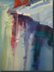
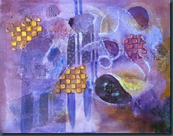
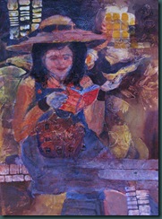
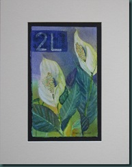
Over the last couple of days I’ve come back into this painting with some opaque light areas and then used a letter stamp, light over dark and dark over light, to create pathways for the eye to move around in the painting. The butterfly represents life in the midst of cold, sterile winter [the view from the window]. I think it is saying what I’m feeling much better than I can explain with words. Interesting.
Retweet thisThis blog documents my creative journey with watercolor, mixed media, & oil painting. I'm enjoying myself immensely and hope you find something uplifting in my paintings and/or their stories. This blog is primarily about PROCESS. If you'd like to check out PRODUCT, please contact me for information.
Sunday, December 27, 2009
Thursday, December 24, 2009
Merry Christmas! Warm on the Inside start…
I’ve started another acrylic painting using a variety of mediums. I thought I would post a sneak peak. Perhaps it will give me an idea about my next step… seeing the thumbnail images is a great way to get a handle on value at least.

Saturday, December 19, 2009
Circle of Prayer [acrylic on canvas panel, 14”x11”]
This painting is another one begun with a variety of Golden’s acrylic mediums textured with my stash of mostly household odds & sods. It’s a fun way to begin. Here’s what it looked like at various stages along the way:
- Just a bunch of texture with the first bit of painting on it. At this point I am forcing myself to keep it abstract – a hard job when I can “see” subjects popping here and there.
- Here I’ve tried to glaze off some of the extreme purple and make some “bones” to hold it together.
- Texture detail… some of it is 1/8” or more thick molding paste, some lines of tar gel drizzle, flat gesso areas scraped in places, etc.
- At this point I was unable to deny the the obvious scarf covered woman’s head in the top left … I came back to subject again with these abstracted figures by painting their hands and faces white and glazing skin tones. This still needs more bones to hold it together. Although I have added some opaques throughout the painting, they are not jumping out nor are they obvious enough to hold the hands and faces in a context.
- I’ve now added more opaques in a grid which, I hope, completes the understructure.
Am I done? I think I’m close. This is one of those paintings that I have to sleep on. Cheers!
Thursday, December 17, 2009
Rock Isle Lake Raw (14”x8” acrylic)
Gorgeous Rock Isle Lake is high up on Sunshine Meadow near Banff. The views are spectacular up there – lots of inspiration for artists and nature lovers alike.
Back in June I painted this location in watercolor. In this painting I gave it another go in transparent acrylic and yet it has a very watercolor look to it. It also has a stark, cold feel that my previous painting doesn’t have. That could be due to the Jekyll and Hyde weather we had that day – everything from sun to snow in 30 minute rotation.
I highly recommend the summer shuttle bus to the top and a brisk hike in that spectacular air! For more summer inspiration check out the White Mountain Adventures photos. Or, check out the webcams at skibanff.com to see what it looks like up there right now. Brrrrr!
Retweet thisTuesday, December 15, 2009
Early Bird [acrylic on cotton mat board]

For more information email me.
Retweet thisMonday, December 14, 2009
Textures Using Acrylic Medium
I continue to discover new methods for using acrylic paints and mediums every week in my Monday mixed media class. The possibilities are really endless! Last week we used a variety of acrylic mediums and improvised tools to create physical textures on our chosen surface [canvas board, watercolor paper, mat board, or stretched canvas]. Each medium appears differently on each surface – do the math on that! Lots of opportunity to play for life.
In this example I started by drizzling gesso in an area and then flattened a portion of that with a palette knife and did some scrafetti into it. Then I pressed some light molding paste through a box stencil, spread some gel gloss [regular & and soft] and then scraped into, pressed into, and stamped into it with various items to create textures. After all of this dried I puddled dilute fluid acrylics in warm tones across the surface. The paint dries differently in each of the various areas of texture. It makes for an interesting start – but, most of the texture is not visible on this photo. [Note: all products listed are made by Golden]
We were meant to work with this start abstractly at least at the beginning but I find that very challenging. Without “thingness” I struggle to know how to move forward. However, I dove in and glazed some transparent areas then added darker passages and towards the end some opaque areas. I tend to see figures in everything I look at and this was no exception. It naturally evolved, what can I say?
Naturally, this process is a teeter-totter – if you make a mark in one place you have to respond to that mark somewhere else. Completing a piece could, quite literally, take forever. It’s a matter of knowing what you like and quitting as soon as you see it. Doesn’t that sound easy? HA HA… right!!!! It’s a bit like putting a jigsaw puzzle together without any edges. The good news is that light areas can be lost and found and lost and found again – yay for acrylics! It’s a fun challenge. Here’s a photo of the piece as it was before class today, warts and all. I’ll have a new and improved version here tomorrow. Cheers!
Retweet thisThursday, December 10, 2009
Acrylic applied as in "oils" fashion… and more paintings for sale
Last week my Monday painting class homework was to work on a painting using acrylic paints thickly, somewhat like is done with oils. The week had shot by with NO time for me to sit down to experiment. Monday morning I awoke at a decent hour and got busy. I used a palette knife to do all but a few glazes over the entire surface. This little painting [about 5”x6”] was simply to get a feel for how the materials works with heavier mediums added to them. It was a lot of fun – I just played! 
“Cosmos” [$50] and “Lilies" [$50] are both double matted and backed with archival material ready to pop into a standard 8.5” x 11” frames.
“Manitou Day Lilies” [ $60] and “Apple Blossoms” [$50] are both double matted and backed with archival material ready to pop into 12”x12” frames which are quite common.


Tuesday, December 8, 2009
Paintings available for purchase…
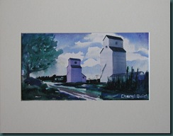
The following original watercolor paintings are available for purchase [archival quality matting and backing as shown]:

$45 – Choice of 3 small paintings of the same subject [matted to fit standard 11x14” frame]:


Monday, December 7, 2009
Back from the framing marathon…
This blog has suffered some neglect this fall, particularly over the past 3 weeks while I matted and framed some of my paintings for the Market Collective last weekend. I’m excited to get back painting again. Also, I’m happy to report that my experience at the market was good despite the scary winter storm that we had over the weekend – it certainly hampered the usual traffic for the vendors.
Thanks to all of you that were able to come by the market over the weekend on those awful roads. Here are the pieces I sold over the weekend…I just love the look of these red dots don’t you?
Stay tuned tomorrow for information on paintings that are still available and how you can make one yours. Cheers!
Retweet thisTuesday, November 24, 2009
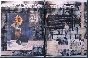
Altered book – Heidi’s last spread
It’s been a long time since I posted on my blog… too long. But, I’ve made a lot of progress with preparation for the Dec 5/6 Market Collective. More on that soon.
This evening Sharon, Lindsey, Sheila, Heidi and I met for a little windup party for our altered book collaboration. It was so much fun to pass the books around and talk over the various methods used. What a talented bunch of friends I have!
Happy Thanksgiving to all my friends and family in the USA!
Retweet thisMonday, November 16, 2009
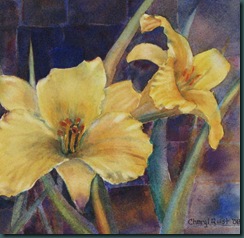
Manitou Day Lilies Revisited [8”x8” watercolor]
Over the past few years I’ve accumulated a lot of paintings in various stages of completion. I did this painting and blogged about it about a year ago. This is what it looked like then.
Something has always bugged me about it but I couldn’t put my finger on it. I decided I’d give it one more chance by glazing the busy background and distracting colors in the leaves with a unifying, complementary violet. A friend was over here painting that day and she suggested that the left lily just wasn’t working shape-wise… [never-mind that’s how God made it, lol]. So, I went to work reshaping the top petal and pushing it back into the background. I also lifted some paint out of the lilies and gave them some highlights. One last step seemed advisable… I cropped the painting down to make the right lily dominant. I like it a LOT better. What do you think?
Retweet thisSunday, November 15, 2009
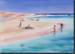
Egyptian Beach Fun [14x11, watercolor]
Wednesday, November 11, 2009
Misty Mountain Morning [17 1/2” x 13 1/5” acrylic on Canson watercolor board]
I puttered on this painting a bit yesterday and again today and I think I have the feeling I was looking for at the beginning. There really is no end to what can be done with acrylics! Taking things out and putting things in is far easier than it is with watercolor. But, I’ve taken this as far as I can right now. I’ll live with it a bit before I decide whether I need to do anything further.
I am now into the “guilt free zone” with acrylics… no more watercolor purist for me! I’ll use whatever works to get the job done. Sometimes that will be watercolor, sometimes acrylic, sometimes mixed media… On Monday I had my second mixed media class of the fall. We’re spending a few weeks on acrylic techniques before moving on. Fun times!
I spent most of today updating my inventory log and measuring paintings in preparation for mats and/or frames. I have 40+ paintings that I’m finally getting ready to sell. I will post them all here soon and you can have first dibs on them. Cheers!
Retweet thisMonday, November 9, 2009
Acrylic Landscape… start
Acrylics… wow, it’s going to take a little while to work the kinks out of this new medium for me. I find the transparent, translucent, and opaque qualities of acrylic a challenge to apply. In this painting I struggled to get the misty feel with the translucent veil application – the tube acrylic didn’t blend easily with the water and I ended up with streaks down the left side. Two things will sort this out: more experience and using fluid acrylics instead of the tubes.
Somehow when I see my work in the small thumbnail format like this I can see the obvious compositional flaws. In this painting I have a tangent in the bottom left corner where the snow bank lines up with the bottom right branch of the tree. While I’m sorting that out I will also rework the branches to give them a bit more variety. Right now they look strangely even in places. If I fix that area and push the values a bit further in a few places I should be happier with the result. I will give this one another go soon and post the results… until then, ciao!
Retweet thisFriday, November 6, 2009
Altered Book spread – Tea
Many of you know that I’ve been involved in a collaborative altered book project since May. I got off to a late start due to the birth of my grandson Kai in May so I’m just winding up now. I have this spread and one more to tell you about.
The hospitali-tea theme for Heidi’s book has been fun. It has brought to mind all the fun tea-parties I’ve attended over many years - first as a child, then a mother, and now a grandma. We could all stand to have more of the simple joy of a child’s tea-party. On the left page I transferred a photo of 2 little girls entertaining each other and their doll. Weeks ago I found some colorful photos of china in Sheila’s [thanks] stash and I collaged these on the right side along with a quote from George Gissing, “the mere chink of cups and saucers tunes the mind to happy repose”.
Have a cup of tea with a friend soon!
Retweet thisWednesday, November 4, 2009
Stephen Quiller Workshop – Sunday October 25
I have just one more demo to review from Sunday at the workshop. This one involved snow again – I think we caught Steve in his windup to the ski season!
In this demo Steve was using Crescent watercolor board which had been toned with a thin layer of neutral violet and blue acrylic, cooler at the top and warmer towards the bottom of the board. As Steve sketched up his demo he briefly reviewed the way that, given a single light source, cast shadows radiate out from an object. He also described these shadows as darker and cooler closer to the object casting the shadow, and lighter, warmer and more diffuse further away. Obviously this was not news but described in a way I finally “got”.
After this introduction, Steve laid in some tree shapes in the top right of the paper to give us a feel for where the light and shadow 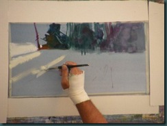


It was such a privilege to learn from such a gentle, humble master painter. I hope I have the joy of sitting under his teaching another time – who knows... maybe even next year in Scotland!

I would also like to take this opportunity to thank the folks at Spokane Art Supply for their awesome hospitality, especially Shirley for keeping things organized and running smoothly and Claudia for her amazing baked goodies!
And now to paint... ciao!
Retweet thisMonday, November 2, 2009
Stephen Quiller Workshop – Spokane, Oct 21-25
Yesterday’s blog described Steve’s teaching on the use of acrylic transparently. The terms transparent, translucent and opaque are discussed in depth on page 43 of WaterMedia Painting with Stephen Quiller. Suffice to say that an artist can achieve some very interesting visual affects playing these techniques off of each other.
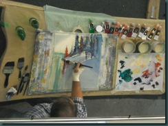
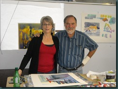
Please note – many of the photos appear backwards as they were taken in the overhead teaching mirror. The finished pieces are oriented correctly. Thank you to Janis Kestle and Joanne Edie for providing most of these photos.
Saturday afternoon. Steve demonstrated the use of transparent and translucent color in a dockside demo. He used a transparent background wash of yellows which had been allowed to dry completely. Adding a small amount of white paint to a thin wash of 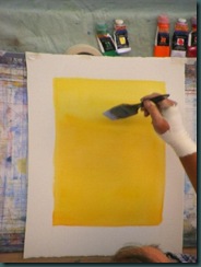

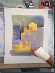
After allowing us some time to work on our own we regrouped and Steve began a demo using transparent, translucent, and opaque acrylic on Crescent watercolor board. This is a very thick support relative to even the 300lb watercolor paper Steve had been using to that point in the workshop.
Steve had prepared the board with a neutral blue through violet tone and had allowed it to dry. After a very quick sketch Steve painted in 
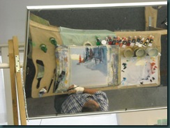

Steve wet the entire bottom section and painted the reflections by pulling straight down from top to bottom. He worked his magic on the details even here lifting out some areas and lightening others with the yellow/white mix. He described this as partly defining the 